
Singular Spectrum Analysis in R
time-series r Singular spectrum analysis (SSA)……
library(lubridate)
library(Rssa)

# get data
data = read.csv('some_important_KPI.csv',stringsAsFactors = FALSE)
dates = as.Date(data$dates)
kpi = data$kpi
kpi_ssa = ssa(kpi)
plot(s)
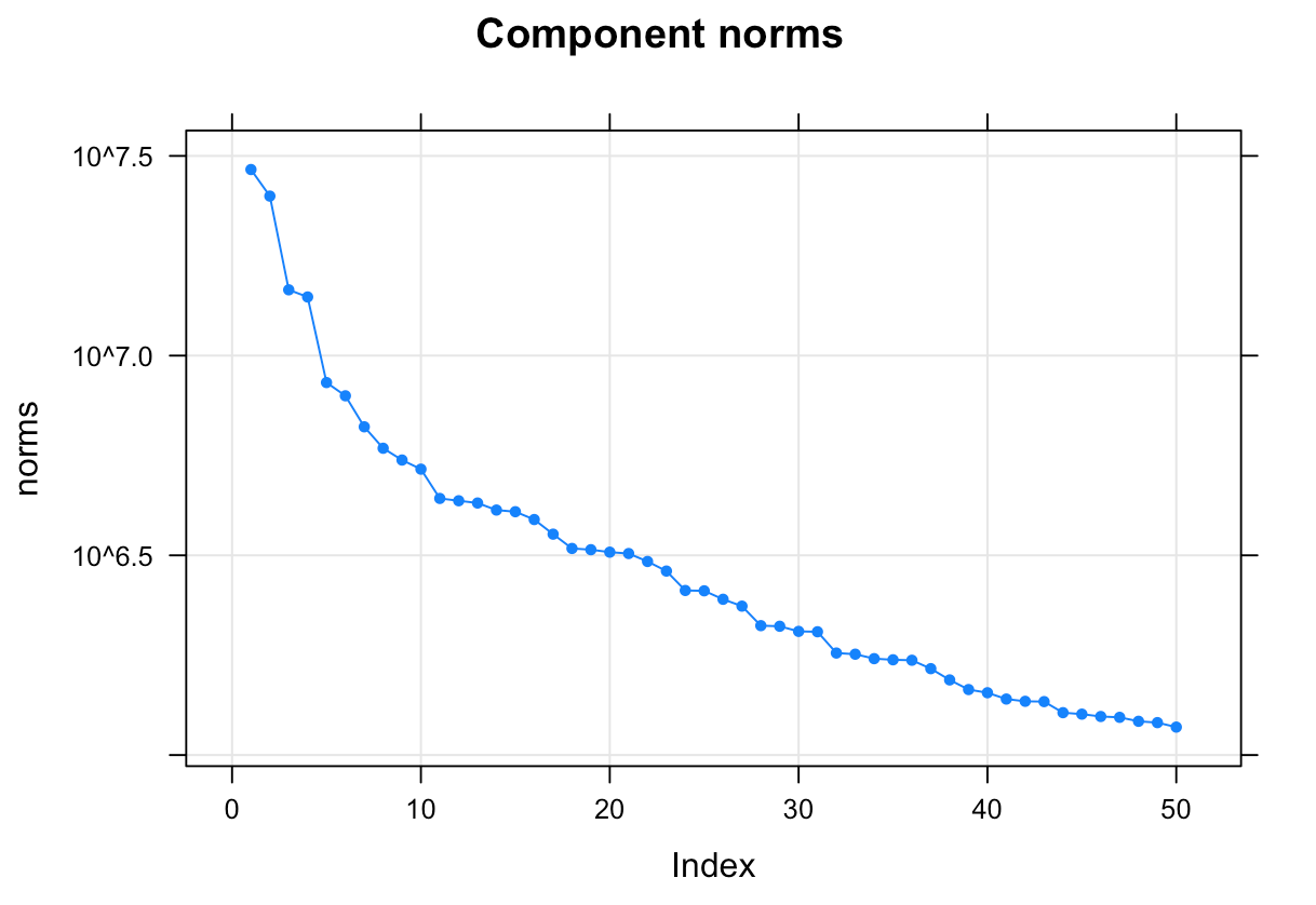
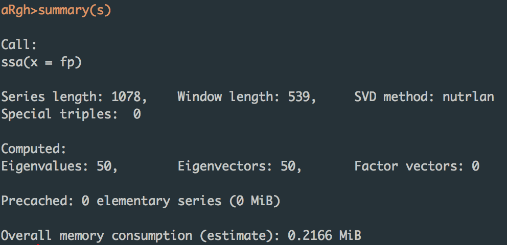
summary(s)
How does this package Work?
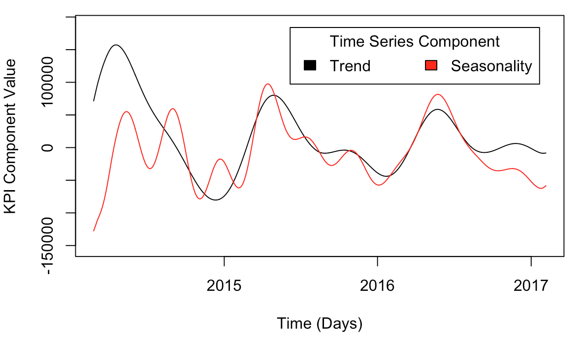
In the example given in the documentation, for whatever reason, the 1st and 4th components are considered the trend, while the seasonality is considered to be components 2, 3, 5, and 6.
r1 = reconstruct(s, groups = list(Trend=c(1,4), Seasonality=c(2:3,5:6)))
ymin = min(r1$Trend, r1$Seasonality)
ymax = max(r1$Trend, r1$Seasonality)
plot(dates, r1$Trend,
     type='l',
     xlab='Time (Days)',
     ylab='KPI Component Value',
     ylim = c(1.2*ymin, 1.2*ymax),
)
lines(dates, r1$Seasonality, col='red')
legend("topright",
     c('Trend', 'Seasonality'),
     title="Time Series Component",
     fill=c('black','red'),
     inset=.05,
     horiz=TRUE,
)
Component Reconstructions
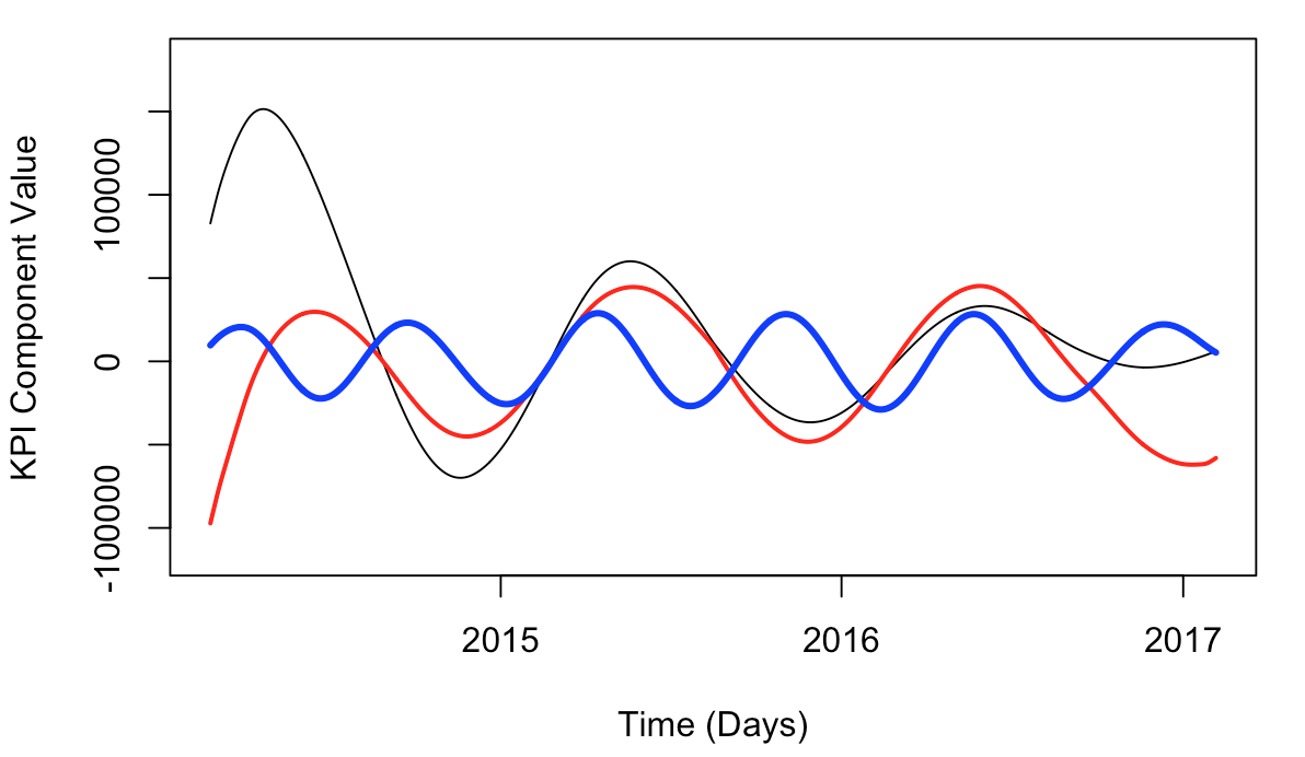
You can technically reconstruct time series components however you want.
custom = reconstruct(s, groups = list(g1=c(1), g2=c(2), g3=c(3)))
ymin = min(custom$g1, custom$g2, custom$g3)
ymax = max(custom$g1, custom$g2, custom$g3)
plot(dates, custom$g1,
     type='l',
     xlab='Time (Days)',
     ylab='KPI Component Value',
     ylim = c(1.2*ymin, 1.2*ymax)
)
lines(dates, custom$g2, col='red', lwd=2)
lines(dates, custom$g3, col='blue', lwd=3)
Eyeballn’ It!
From inspection, we can start piecing together apparent oscillations, e.g., a yearly and 6-month cadence.
rts = reconstruct(s, groups=list(Yearly=c(1:2), g3=c(3), g4=c(4), g5=c(5), g6=c(6)))
plot(dates, rts$Yearly, type="l", xlab='Time (Days)', ylab='KPI Component Value')
lines(dates, rts$g4, col='red')
lines(dates, rts$g5, col='blue')
lines(dates, rts$g6, col='purple')
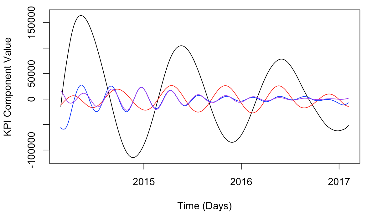
From this, it looks like g4 is about a 6-month oscillation, whereas g5 is more like a 3.5 month oscillation whose amplitude decays over time. Group g6 has a similar periodicity to g5, but – different.
Side Note: Honestly, there has to be a better way than eyeballin’ this, right? I’m used to getting frequency and amplitude estimates using things like the windowed short-time Fourier transform, or multitaper method. But for the sake of learning something new (SSA), I’ll hang in here for a bit.
Ultimately, I did a lot of fudging around with reconstructions, attempting to develop an intuition for what the best construction would be given what I know about the KPI from an intuitive standpoint.
r = reconstruct(s, groups=list(Yearly=c(1:2),
      sixMnth=c(3:4),fourMnth=c(5:6),
      g7=c(7), g8=c(8), g9=c(9)))

# Sanity Check
plot(r$Yearly,type="l")
lines(r$sixMnth,col='red')
lines(r$fourMnth,col='blue')

# More inspection...
# Other g's
plot(r$Yearly, type="l")
lines(r$g7, col='red')
lines(r$g8, col='blue')
lines(r$g9, col='purple')

# Etc, etc, etc
From eyeballn’ these components, I could say that:
- group g7 is almost a zero line, though it is like a slow-growing linear trend
- groups g8 and g9 are definitely contributors to a ~3-month oscillation
The higher-order components have smaller and smaller variation. Using this arcane eyeball method, I had to plot one at a time and painstakingly guestimate my way to periodicity estimates one at a time… I’ll spare you the repetitive plots and code, and just tell you this:
- g10 has a 6-mnthness to it
- g11 has a 2.5-mnthness to it
- g12 ~2mnthness
- g13 ~2mnthness w/ ~1mnth background
- Adding G11:g13 gives a good 2-mnthness curve
- g14: strong, small amplitude mnthly oscillation
- g15 straight-up 2-weeker
- g16 one-ish at first, then two-ish
- g17 is suddenly a crazy curve…
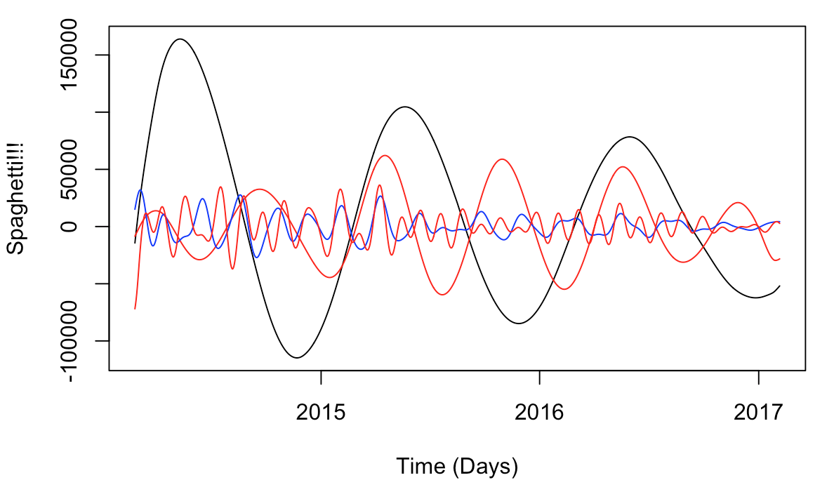
Ultimate Solution w/ Some nice plots
Ultimately, I scrapped this project in favor of other, related projects that seemed better suited to our needs. That said, it was fun to dip my toes into SSA and work my way to some kind of … something. Hey, at least we got some pretty plots! :-p
r = reconstruct(s,
      groups = list(
        Yearly=c(1:2),
        sixMnthly = c(3:4,10),
        specialEvents=c(5:9),
        twoMnth = c(11:13),
        oneMnth=c(14:16,18:20),
        crazy=c(17))
)

# Spaghetti.
plot(dates, r$Yearly, type="l", xlab='Time (Days)', ylab='Spaghetti!!!')
lines(dates, r$sixMnth, col='red')
lines(dates, r$twoMnth, col='blue')
lines(dates, r$oneMnth, col='red')
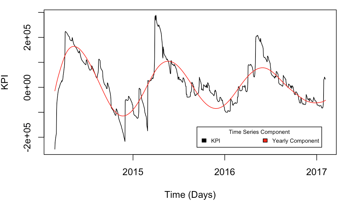
# Yearly vs Data
plot(dates, kpi, type="l", xlab='Time (Days)', ylab='KPI')
lines(dates, r$Yearly, col='red')
legend("bottomright", c('KPI', 'Yearly Component'), title="Time Series Component",
     fill=c('black','red'), inset=.05, horiz=TRUE, cex=0.6)
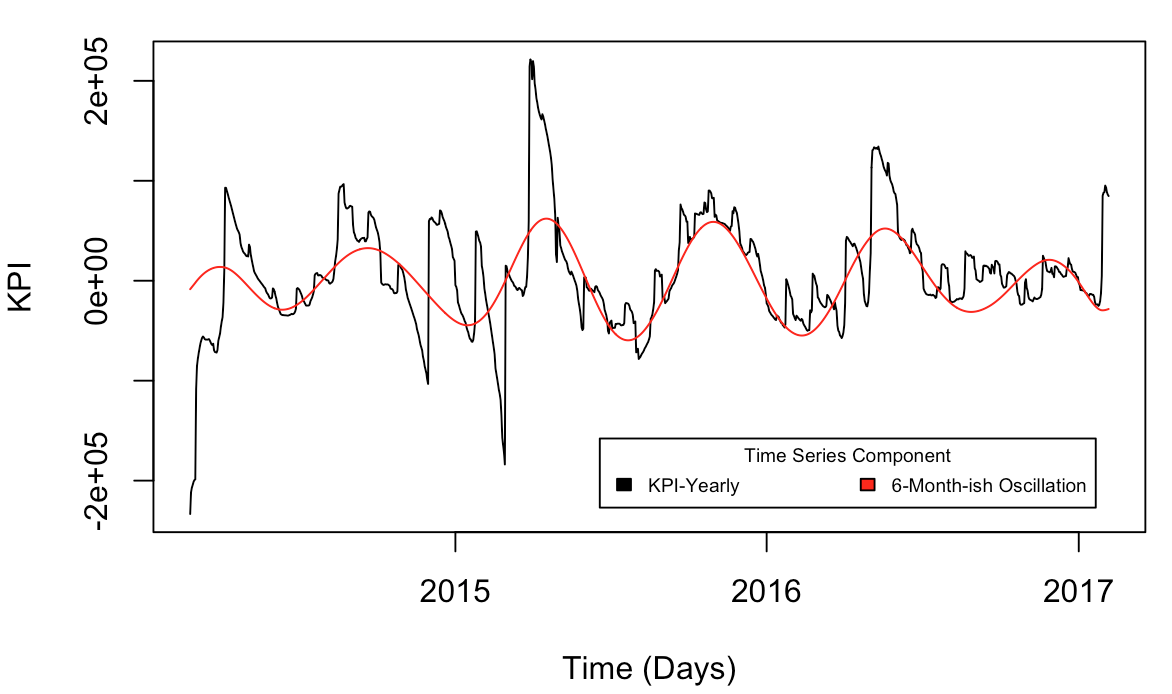
# sixMnthly vs Data-Yearly
plot(dates, fp-r$Yearly, type='l', xlab='Time (Days)', ylab='KPI')
lines(dates, r$sixMnth, col='red')
legend("bottomright", c('KPI-Yearly', '6-Month-ish Oscillation'), title="Time Series Component",
     fill=c('black','red'), inset=.05, horiz=TRUE, cex=0.6)
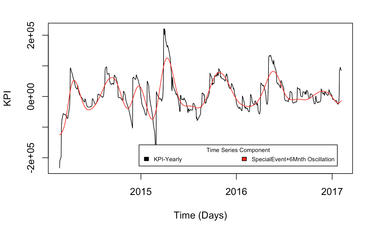
# specialEvents+sixMnthly vs Data-Yearly
plot(dates, fp-r$Yearly, type='l', xlab='Time (Days)', ylab='KPI')
lines(dates, r$specialEvents + r$sixMnthly, col='red')
legend("bottomright", c('KPI-Yearly', 'SpecialEvent+6Mnth Oscillation'), title="Time Series Component",
     fill=c('black','red'), inset=.05, horiz=TRUE, cex=0.6)
Some References
- SSA on Wikipedia
- Rssa on Cran
- Rssa on GitHub
- https://www.statmethods.net/advgraphs/axes.html